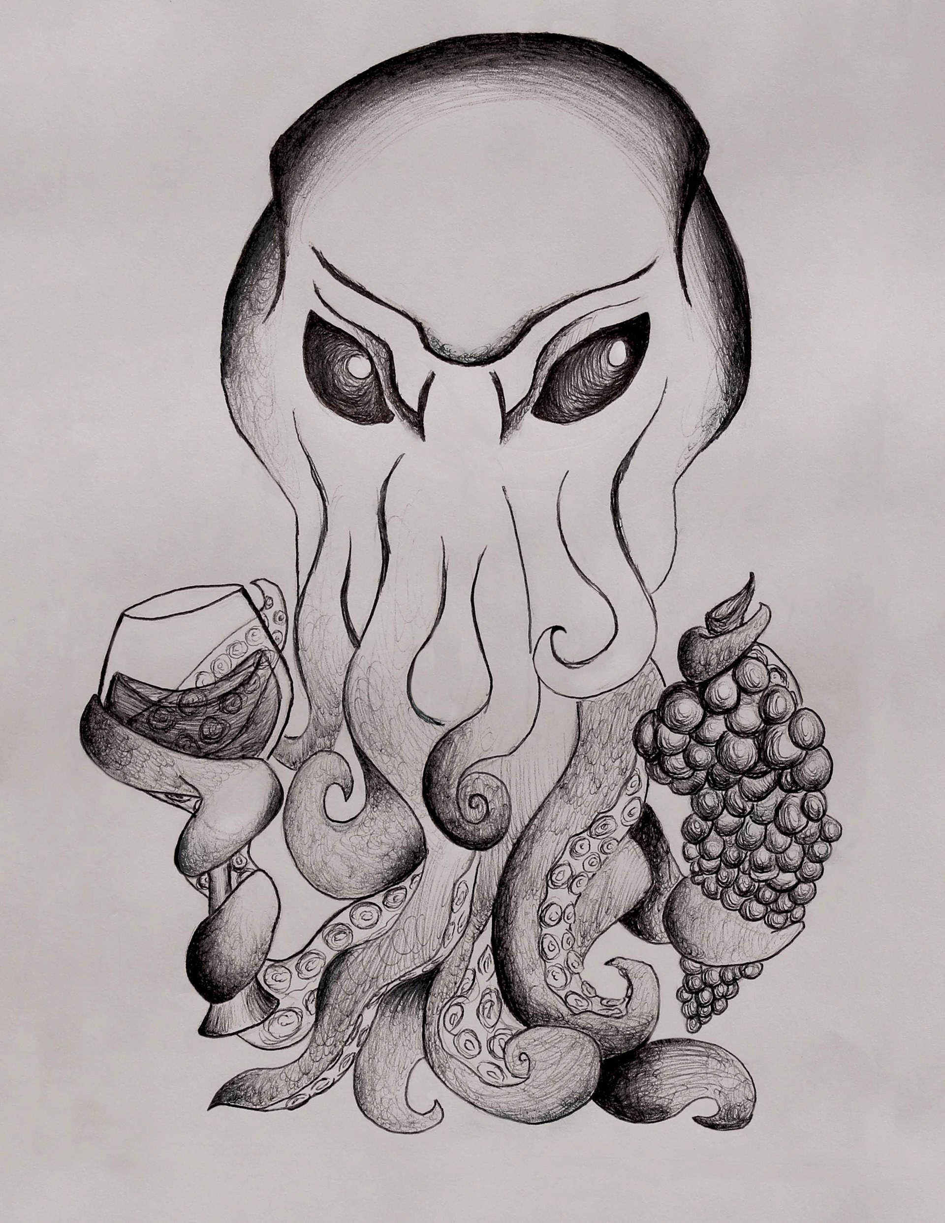
For this illustration, I wanted this to keep an even tone with ball pen illustrations. By using individual strokes with different levels of pressure, I was able to make different contrasts and shading. The techniques of stippling and curved lines helped build shape within the cup and the grapes.
The darks and lights show even contrasts within shadow and highlight and Creative design and balance of context
